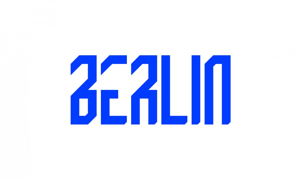
GRAD // kostenloser Font
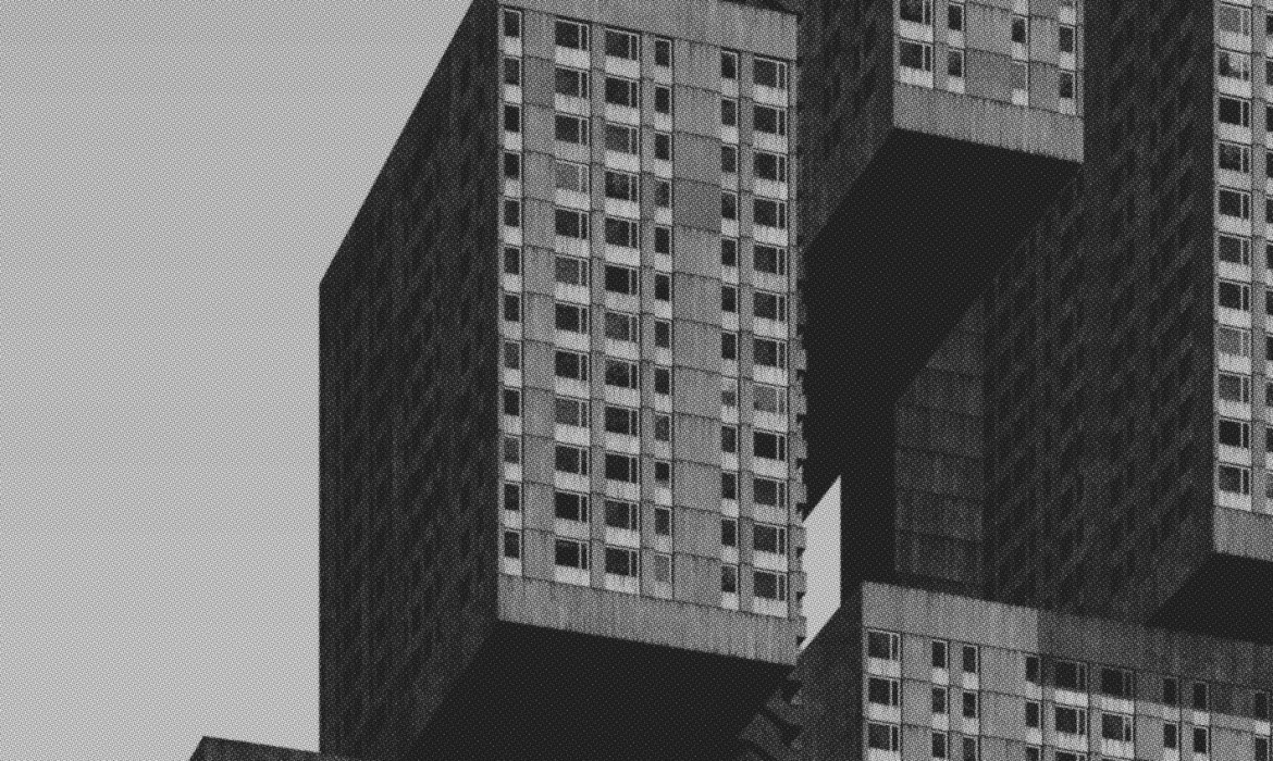
A Future City From The Past // Work by Clemens Gritl
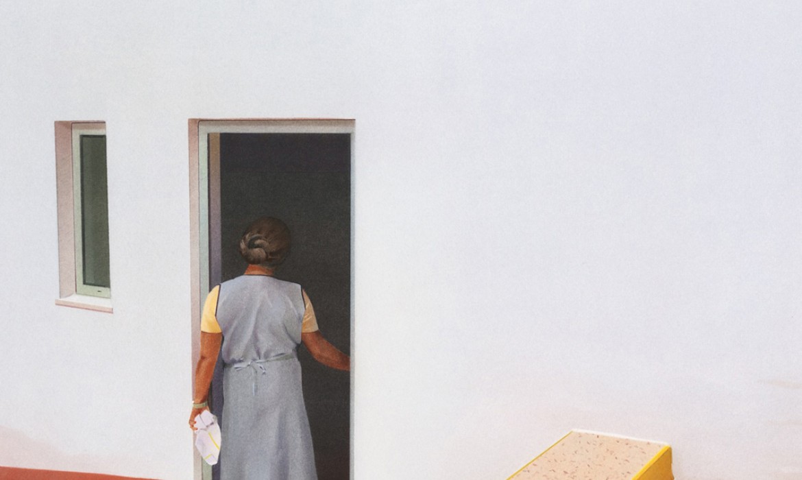
Painting Reality // Gemälde von Anna Roberts
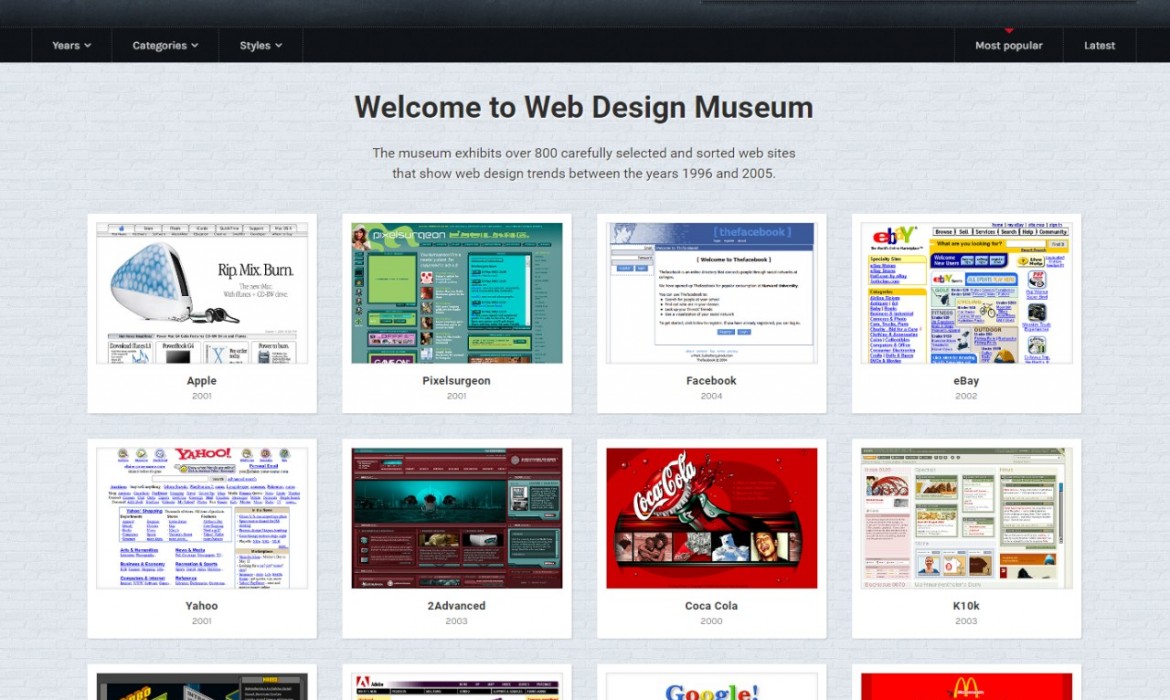
Web Design Museum // Website of the day
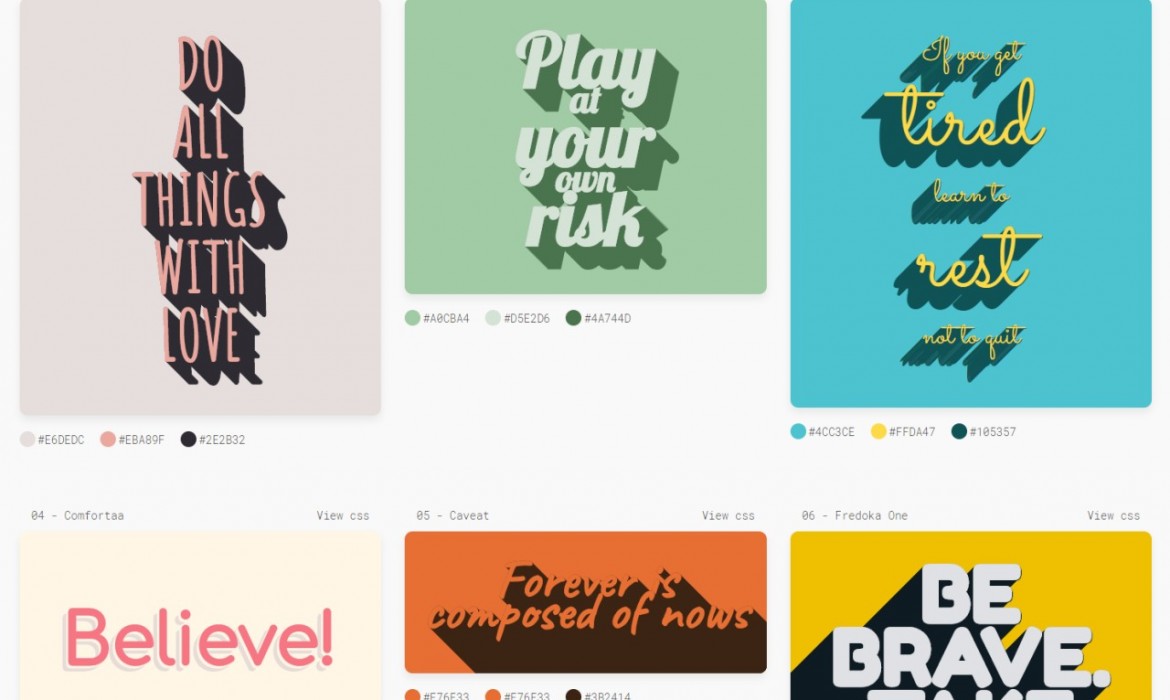
Trendy CSS Text Shadows
The 5000 Colors Puzzle // by Clemens Habicht
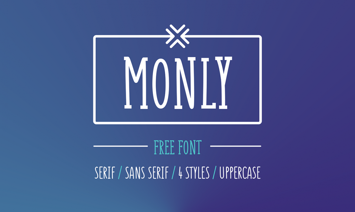
Monly // kostenloser Font in 4 Styles
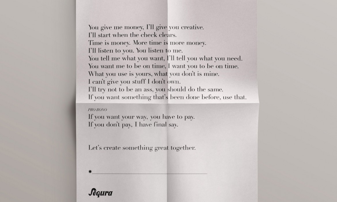
My kind of contract
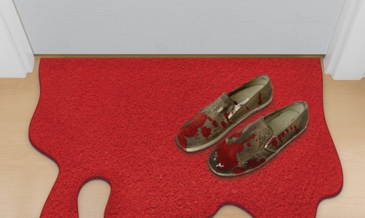
Blood Spill Doormat
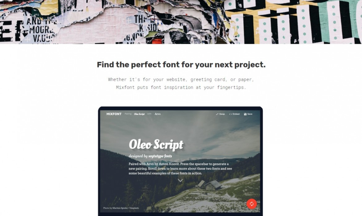
Mixfont // Website of the day